“ I observed a lot of discriminations against plus-size-women in the business world. I want to design clothes to bring them self-confidence. ”
Hélène Tang, founder of HYSA
The project
The client is a fashion designer who pledges for more ethics and inclusivity in the fashion industry. She needed a responsive site which reflect the brand that she was about to launch. It’s a designer clothing brand for plus-size women, made out of scrap fabric, in Parisian sewing workshops.
The team
We were 4 UX/UI Designers to work on this project, each of us with an expertise : retail, journalism, web development and art direction. Each expertise was important at different stages of the project. While being part of every step of the process, I was also the bridge between the team and the client.
The competitors
According to our research, competitors include : crowdfunding platforms, clothing brands on a pre-order system, plus-size clothings brands, and ethical clothing brands. We analysed them in order to find the best practices for the project, which includes all of them. Crowdfunding platforms are a nice reference for the pre-order system since it’s widely known compared to the clothing brands with a similar system. As for plus-size clothing and ethical clothing brands, it’s very rare to have them combined.

The problem
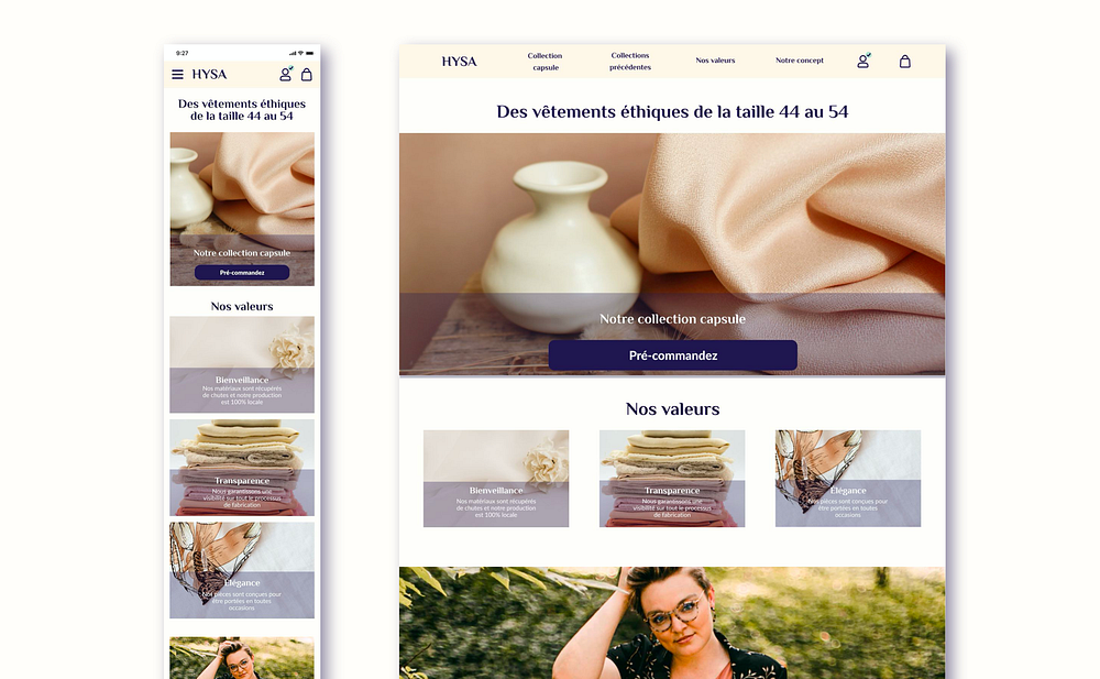
The former sitemap included different links for same pages, making the navigation complicated. We decided for the sitemap of the website to make it simpler and clearer, which put emphasis on the core of the brand on the homepage : the capsule collection with the pre-order system, the values and the previous collection.

We wanted to put emphasis on what make the brand stands out : plus-size and ethical clothing. The pre-order system and the brand values have to appear clearly from the homepage as well. From the user flow, we proceeded on designing the mid-fi version of the website.
The usability testing
We prepared the usability testing interview and proceeded to six interviews where the targeted clientele tested the mid-fi prototype. We found several recurrent points to be improved :
- The values are not detailed enough, the users need descriptions on the terms “Kindness”, “Transparency” and “Elegance”
- The users don’t see clearly that it’s a plus-size brand
- The available sizes are not mentioned early enough
- The pre-order system is not explained clearly before the users validate the order
- The campaign sharing option needs to have a clear incentive for the users to see the advantages of it

The brand identity
The client absolutely wanted to keep a deep indigo colour for the brand. We started from this colour and the values in order to define the art direction. The brand values are in line with the concept of the brand : kindness — with an emphasis on inclusivity, transparency — about the fabrication process from the source of the fabric to the production, and elegance — clothes suitable for both work and casual gatherings. Therefore, the tone of voice has to be positive and reliable. While making the moodboard, we associated the indigo and deep purple with shades of beige and turquoise. We wanted to convey a natural and aquatic feeling, which resulted in the style tiles.

The responsiveness

For the mobile version, we kept the logotype, the profile and the cart icons visible on the top bar. Pictures are placed one after another, but the visual and wording contents remain the same for both versions. During the usability testing, the main insights were on both versions — mobile and desktop.
The next steps
We presented the hi-fi prototype to the client, who said that it conveys her vision for the website. We discussed about the insights from the first usability tests, and we made sure our visions aligned, especially for the final visuals such as products pictures. The next step will be to conduct a second usability tests with the targeted clientele on the high-fidelity prototype, eventually iterate, and to team up with a developer to launch the site.
Thank you for reading ! 👯
